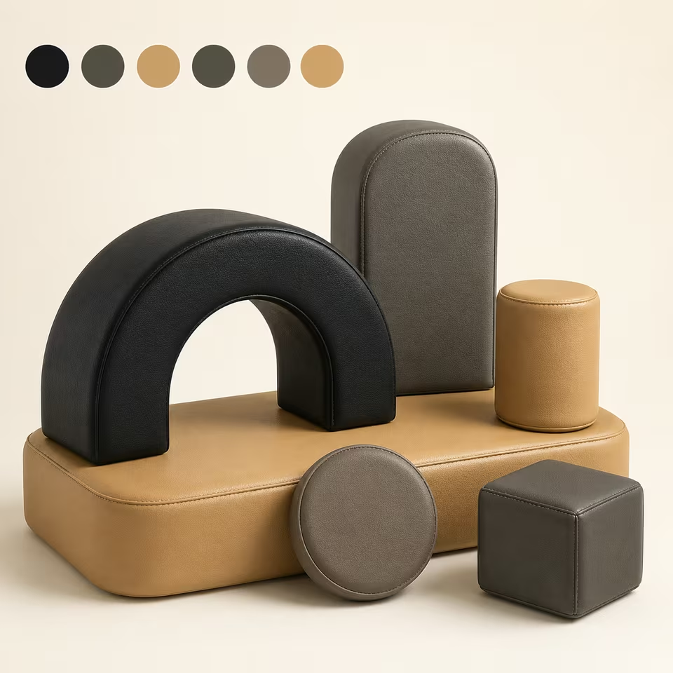
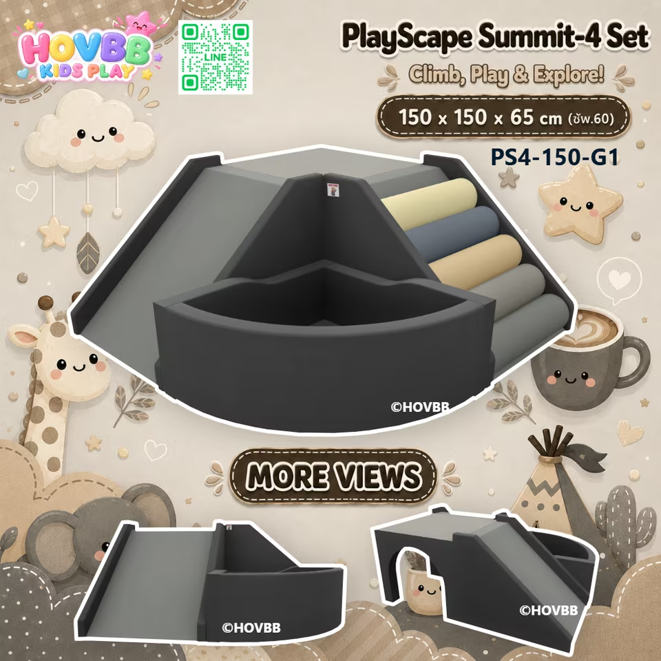
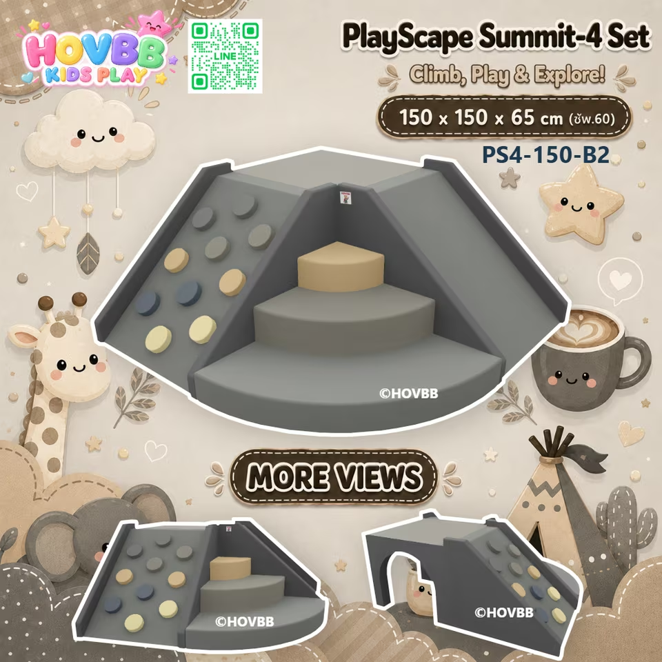
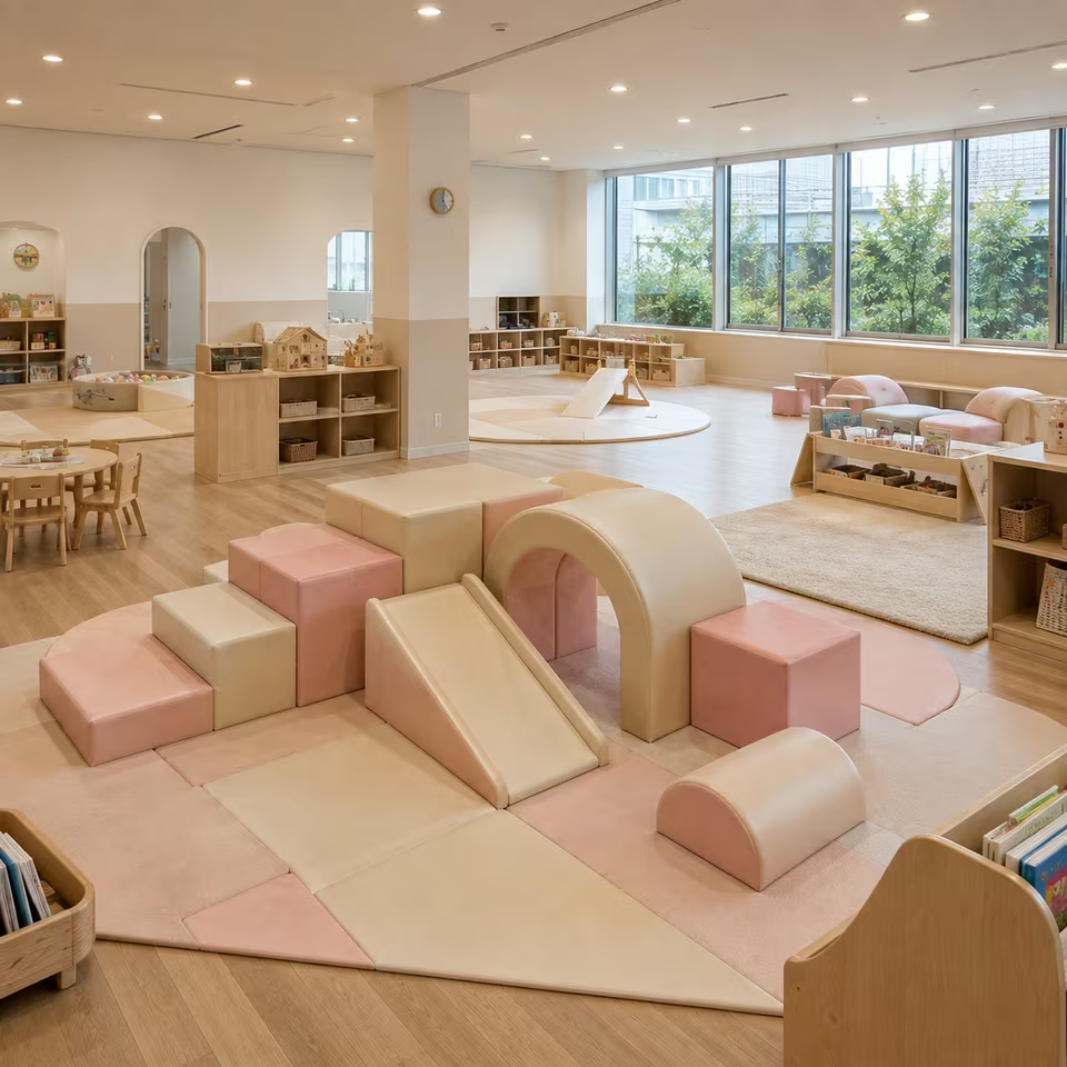
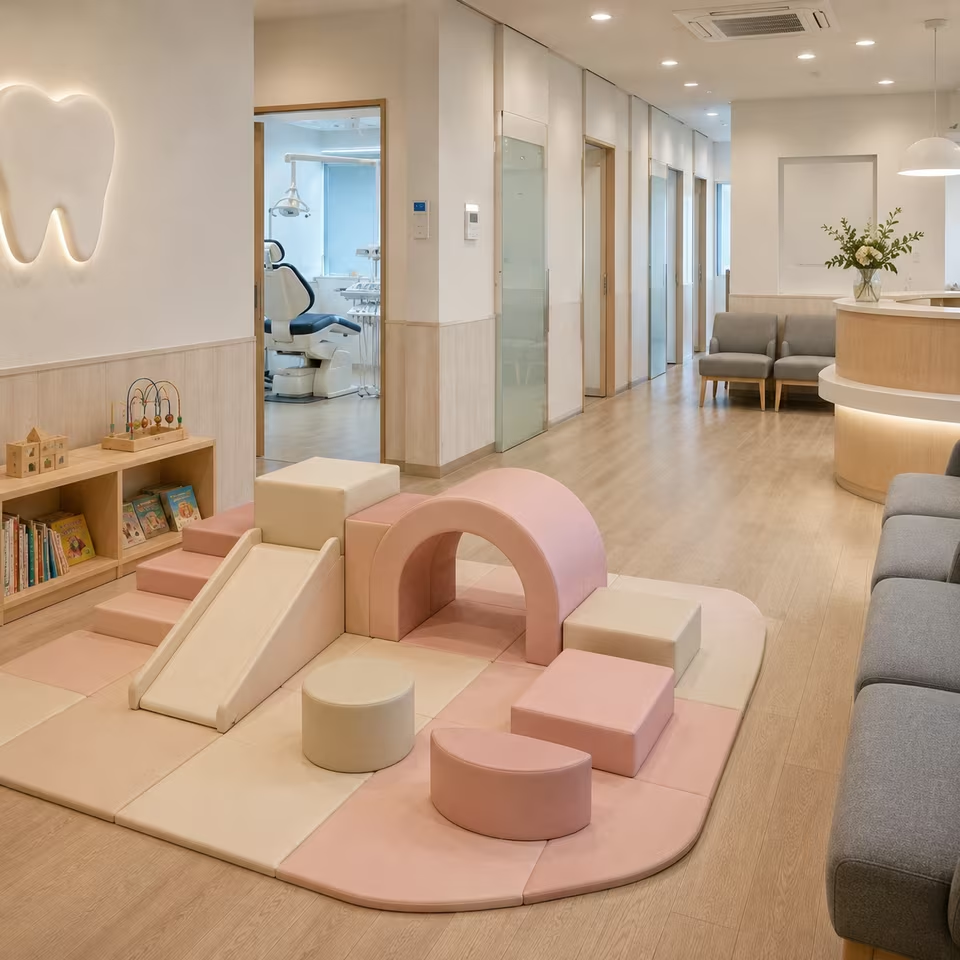
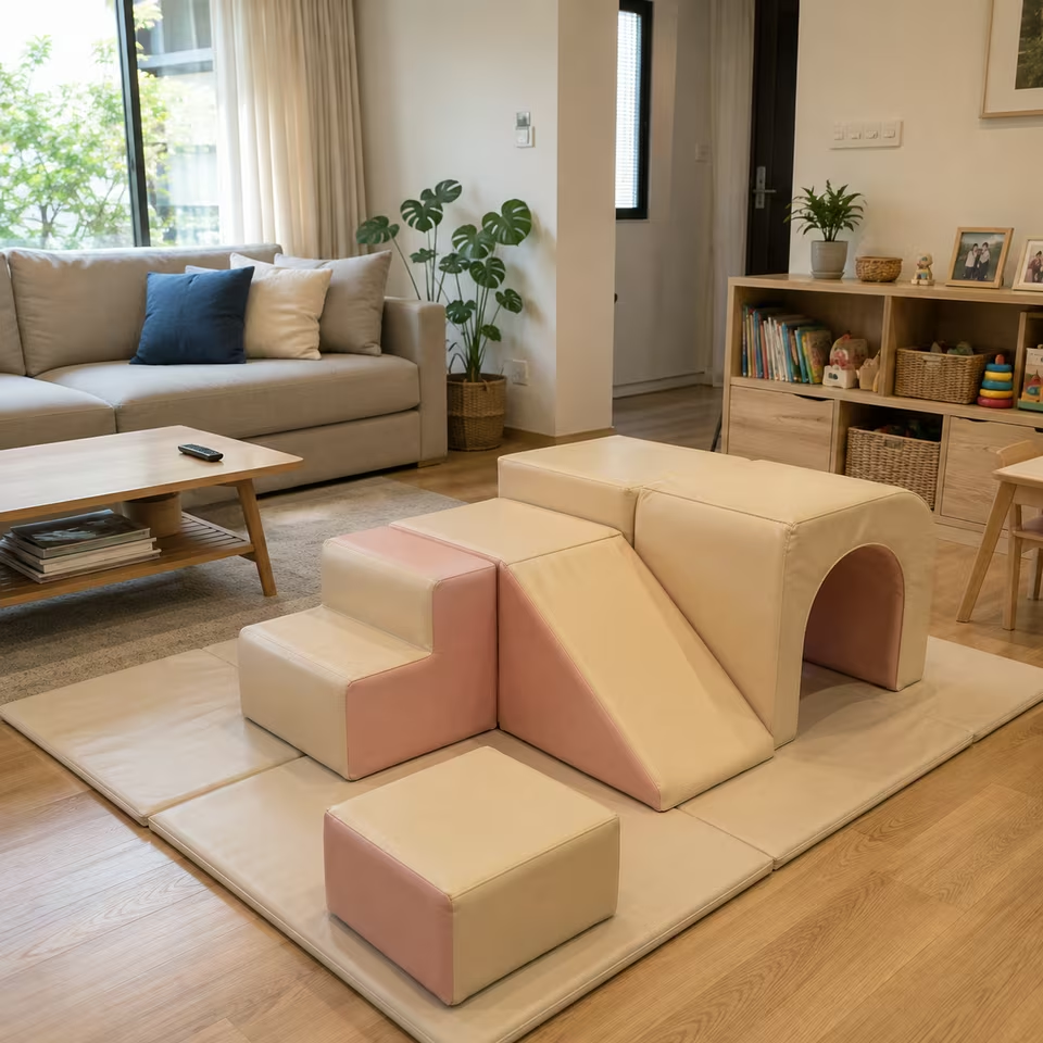
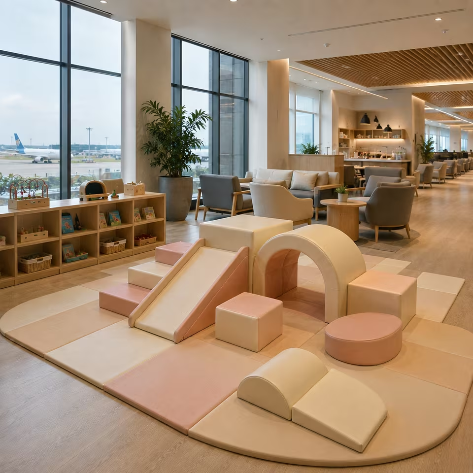
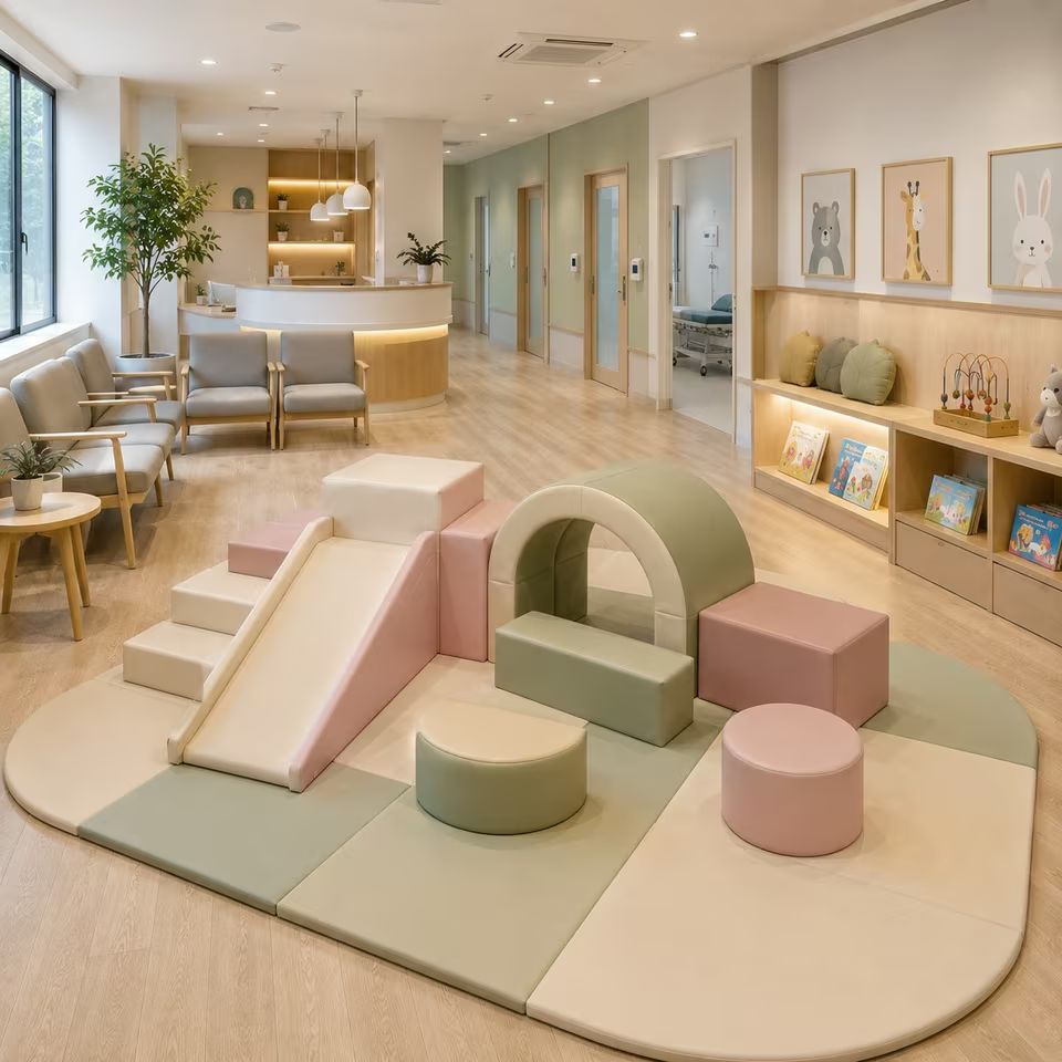
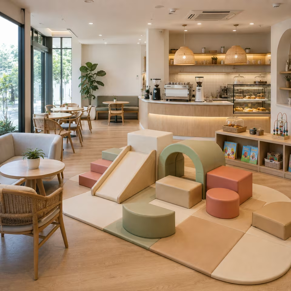
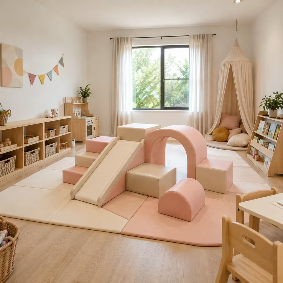
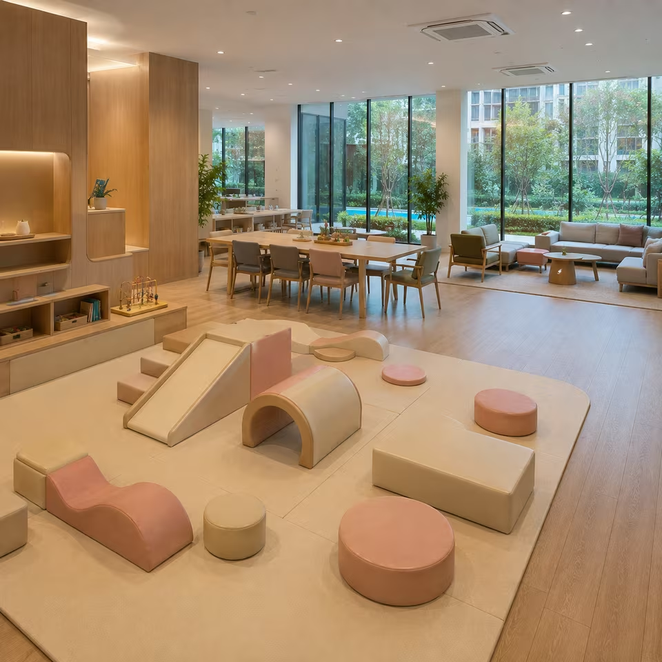
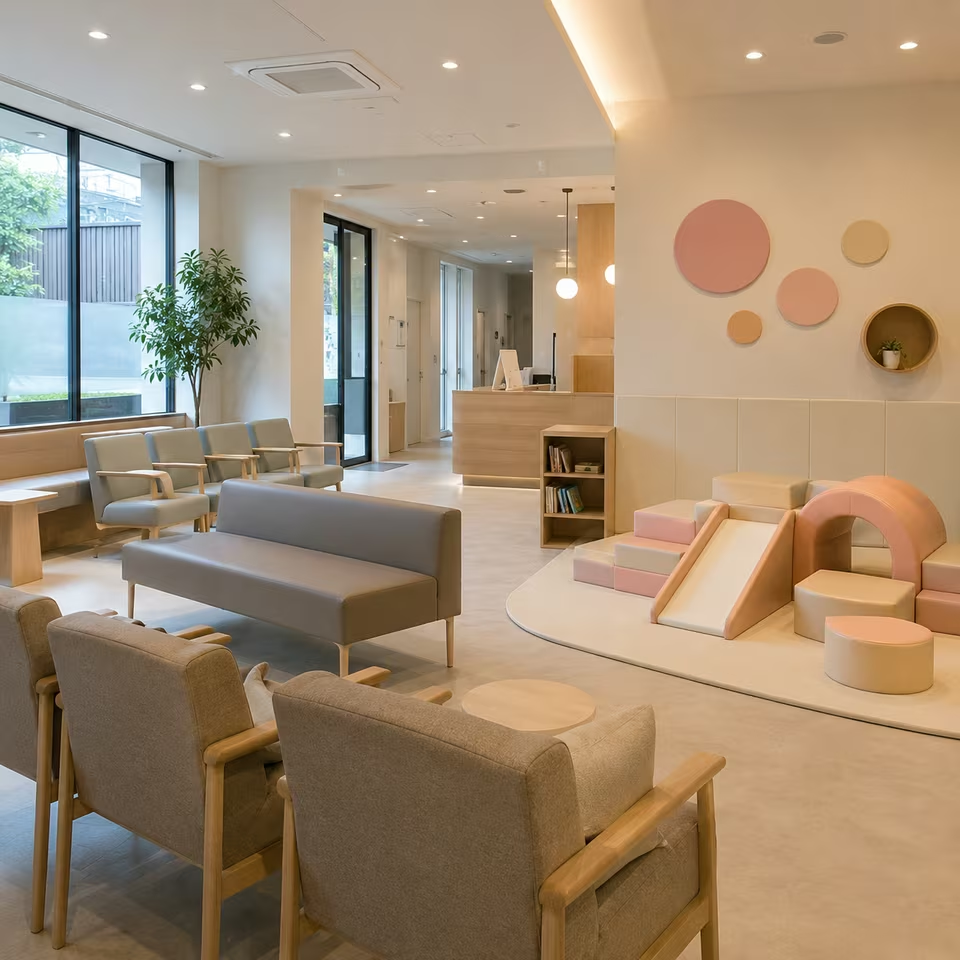
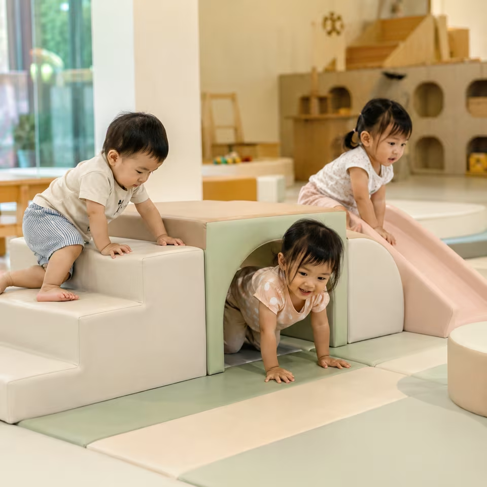
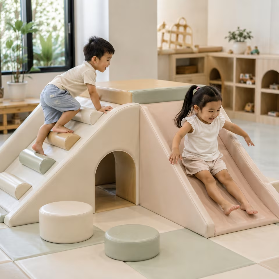
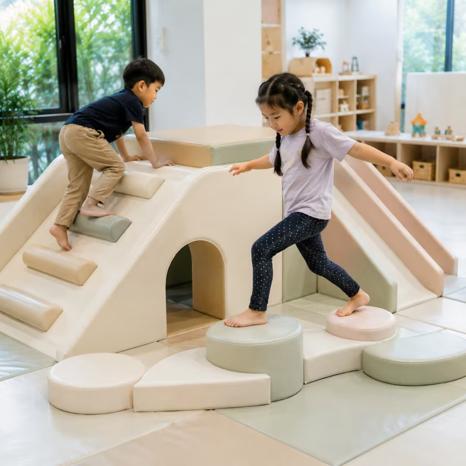
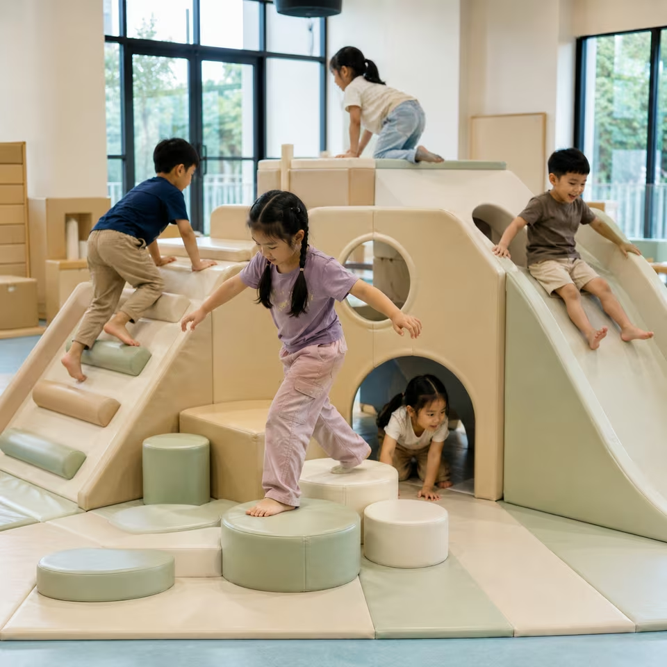
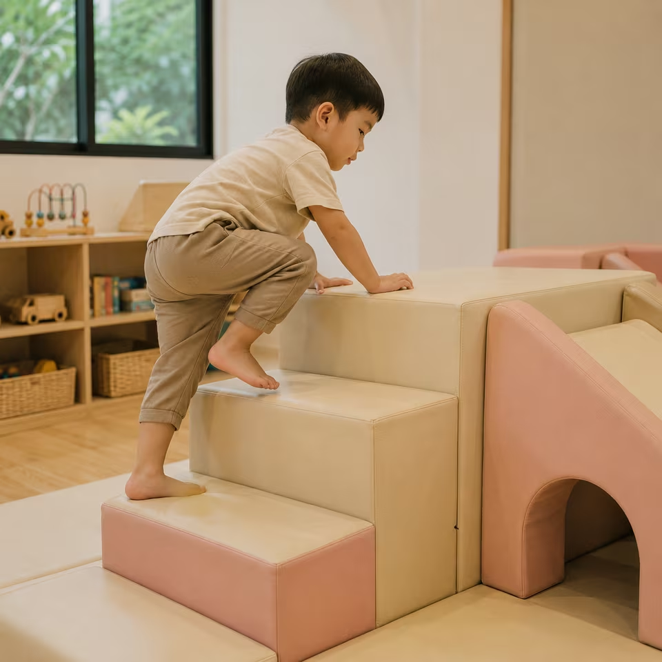
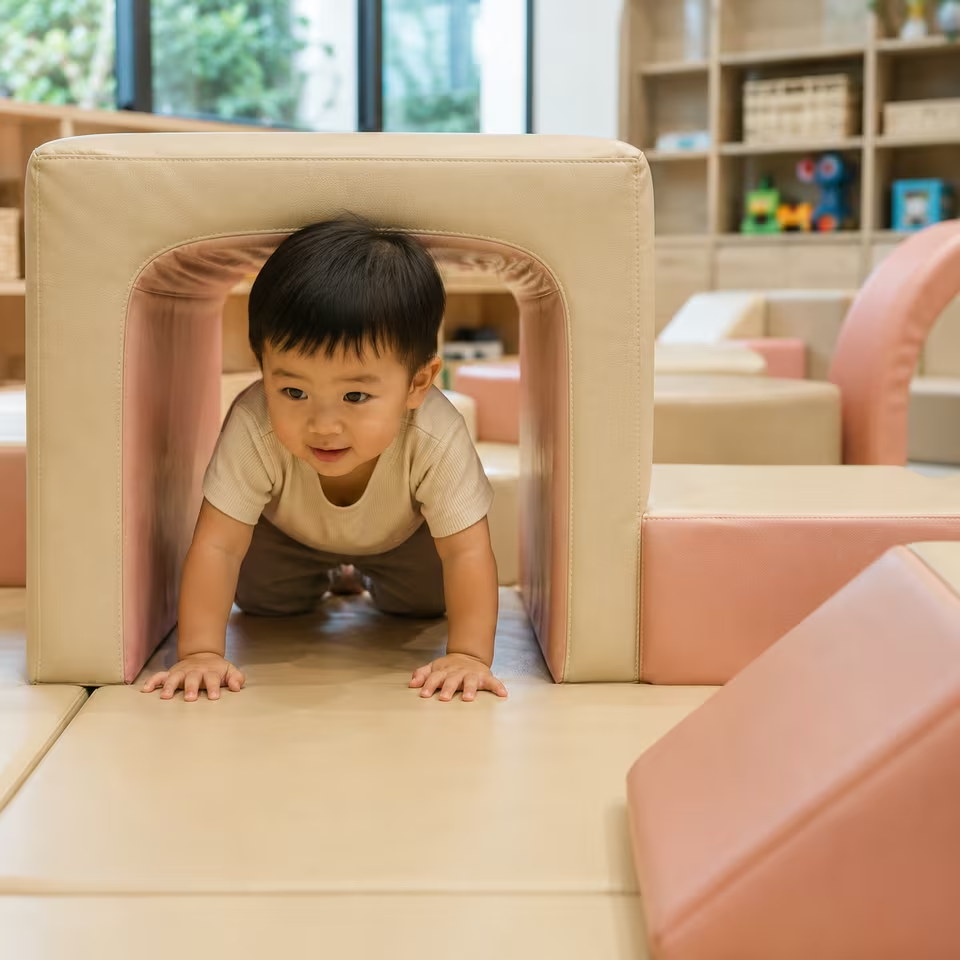
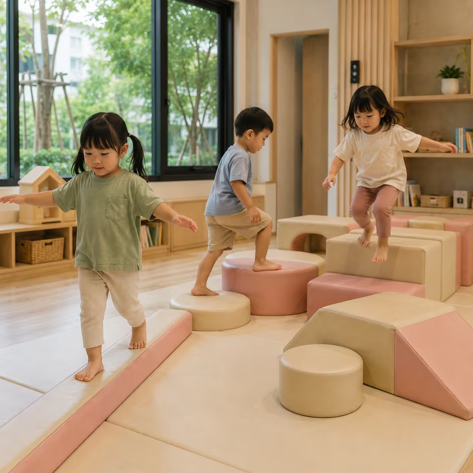
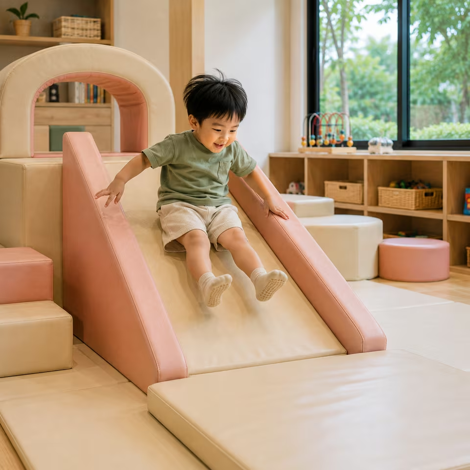
A sophisticated Soft Play palette pairing deep charcoal with warm sand, soft gray and natural neutral tones for a modern, grounded look.
CHARCOAL SAND brings a more architectural and sophisticated character to Soft Play through the contrast between deep charcoal and warm natural neutrals. Darker tones give the play structure definition and visual weight, while sand, taupe and soft gray keep the overall palette warm and approachable. Rather than feeling colorful or overtly childlike, the theme is designed to integrate naturally with contemporary interiors where the play equipment is part of the visual environment. It works especially well with light wood, warm white, beige, stone, concrete-inspired finishes and other restrained materials, creating a Soft Play palette that feels playful in form while remaining calm and refined in color.
Highlights
Deep charcoal balanced with warm sand and natural neutrals
Strong contrast without a harsh black-and-white appearance
Modern, grounded and sophisticated visual character
Pairs naturally with wood, warm white, beige and stone finishes
Allows playful Soft Play forms to sit within refined interiors
A versatile neutral palette for residential and designed spaces
Experience Keywords charcoal soft play · neutral soft play · modern soft play · earth tone playroom · warm neutral play space · minimal kids interior · modern kids playroom · neutral play equipment · sand and charcoal interior · sophisticated play space
Use deep charcoal as a defining contrast rather than allowing it to dominate every major surface.
Balance darker elements with clearly visible sand, taupe, warm gray and lighter neutral areas.
Preserve warmth in the palette so the theme does not drift toward a cold monochrome gray appearance.
Use charcoal strategically on visually strong forms, structural elements or selected climbing surfaces to create depth and definition.
Allow lighter sand and neutral tones to occupy enough visual area to keep larger Soft Play configurations approachable.
The contrast between dark and light elements can help separate forms and make a multi-piece configuration visually easier to read.
Avoid introducing bright primary or highly saturated accent colors that compete with the restrained identity of the theme.
Keep the overall palette low in saturation while maintaining enough tonal separation for individual play elements to remain distinct.
The theme should feel contemporary and architectural without making the play equipment appear industrial or overly serious.
Preserve playful character through the shapes, proportions and arrangement of the Soft Play rather than relying on bright color.
Consider how the darker components distribute visual weight across the complete layout instead of concentrating all charcoal in one area.
When applied to larger structures, repeat the charcoal selectively so the dark tone creates rhythm and continuity across the composition.
Styling Notes
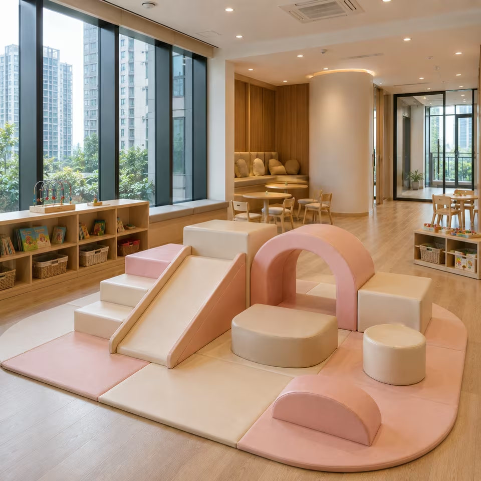
Pair with warm white or creamy walls rather than stark cool white when a softer overall atmosphere is desired.
Light oak, ash and other warm natural woods complement the sand side of the palette particularly well.
Beige, greige, taupe and warm stone surfaces can extend the theme into the surrounding interior without competing with the play equipment.
Concrete-inspired finishes can work when balanced with warmer materials such as wood, textiles or creamy wall colors.
Use charcoal details elsewhere in the room sparingly to visually connect the Soft Play with the interior.
Natural woven textures, subtle fabrics and understated rugs can reinforce the warm, grounded character.
For a more minimal interior, keep surrounding colors restrained and allow the contrast within the Soft Play itself to become the focal point.
For a warmer interpretation, increase the presence of wood, cream, sand and taupe around the play area rather than adding brighter colors.
Black accessories can work in small amounts, but excessive pure black may make the palette feel harsher than the intended charcoal character.
Avoid cool blue-gray surroundings when the goal is to preserve the warm Sand character of the theme.
The palette can work particularly well in contemporary homes, designed playrooms and customer-facing spaces where children's equipment needs to coexist with the interior aesthetic.
Use lighting with a natural or comfortably warm visual character to complement the earthy neutrals rather than making the sand tones appear gray.
FAQ
What is the CHARCOAL SAND Soft Play theme?
CHARCOAL SAND is a warm neutral Soft Play palette built around deep charcoal, sand, taupe and soft gray tones. It creates stronger visual contrast than a light neutral theme while retaining a calm and sophisticated character.
What interior styles work well with CHARCOAL SAND?
The palette works naturally with contemporary, minimal and warm modern interiors, particularly spaces using light wood, warm white, beige, greige, taupe, stone or restrained concrete-inspired finishes.
Is CHARCOAL SAND too dark for a children's playroom?
It does not need to be. Charcoal works best as a defining contrast while sand and lighter neutrals maintain visual balance. The overall result can remain warm and inviting when the darker tones are distributed carefully.
What colors pair well with CHARCOAL SAND Soft Play?
Warm white, cream, beige, taupe, greige, light natural wood and warm stone tones pair particularly well with the palette.
Does a neutral Soft Play theme still look playful?
Yes. Playfulness does not need to come only from bright color. Rounded forms, climbing elements, level changes and the overall arrangement can give the equipment a clear playful character while the palette remains restrained.
Is CHARCOAL SAND suitable for a modern home?
The combination of dark neutral contrast and warm natural tones can integrate well with contemporary residential interiors, particularly when the play area remains visible as part of the main living environment.
Can CHARCOAL SAND work in a commercial kids' space?
The visual theme can work well in customer-facing spaces that use a modern or neutral interior direction. Product suitability for a particular venue should still be evaluated separately according to the specifications and intended use of the equipment.
How is CHARCOAL SAND different from an all-beige Soft Play theme?
The charcoal introduces deeper contrast and stronger definition between forms. This gives the palette a more graphic and architectural character than a predominantly beige or cream theme.