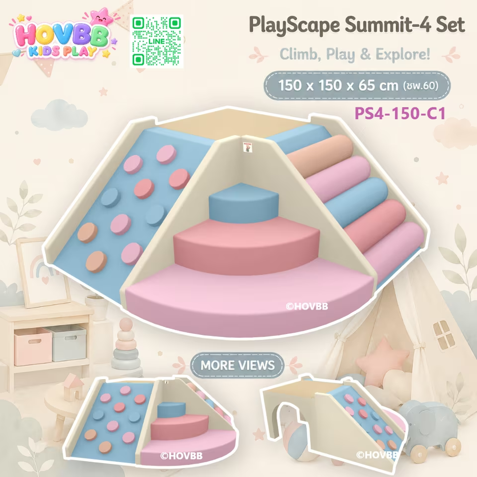
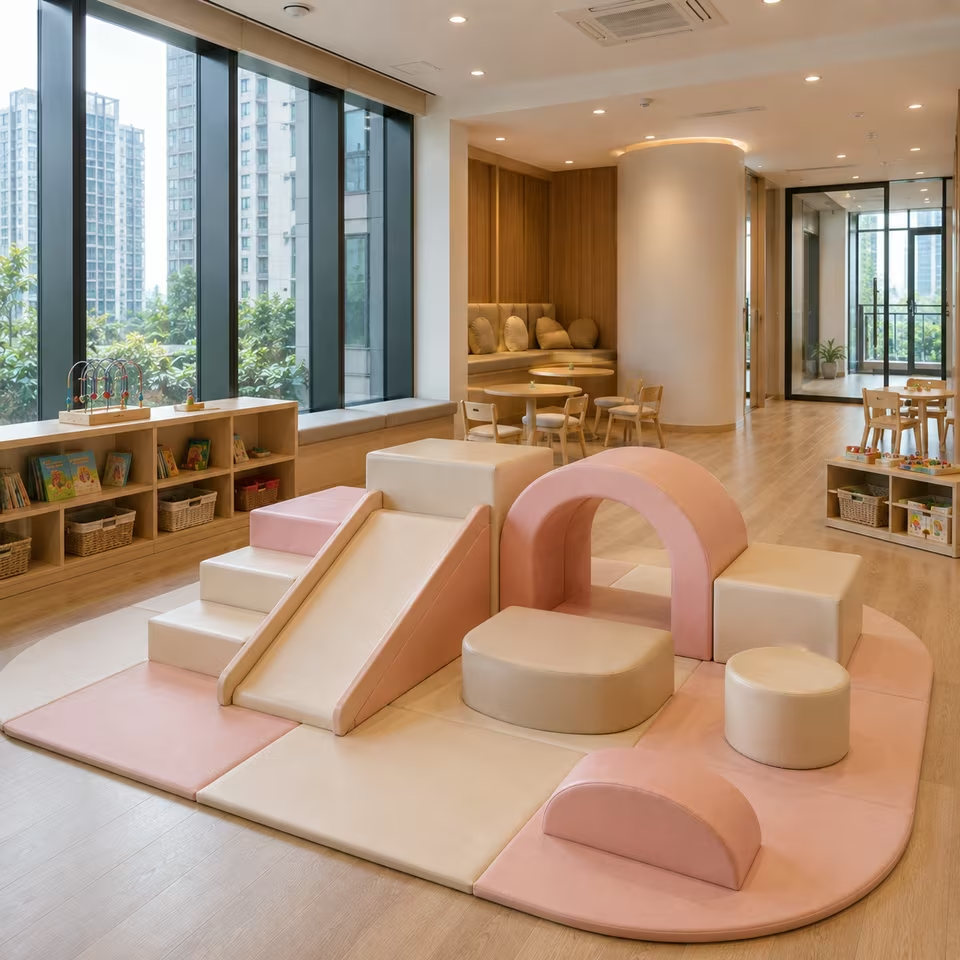
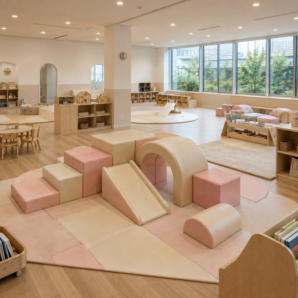
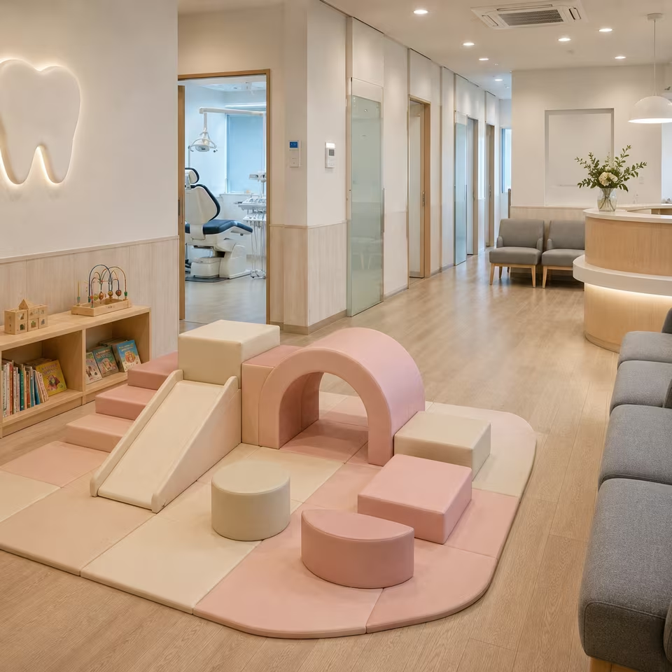
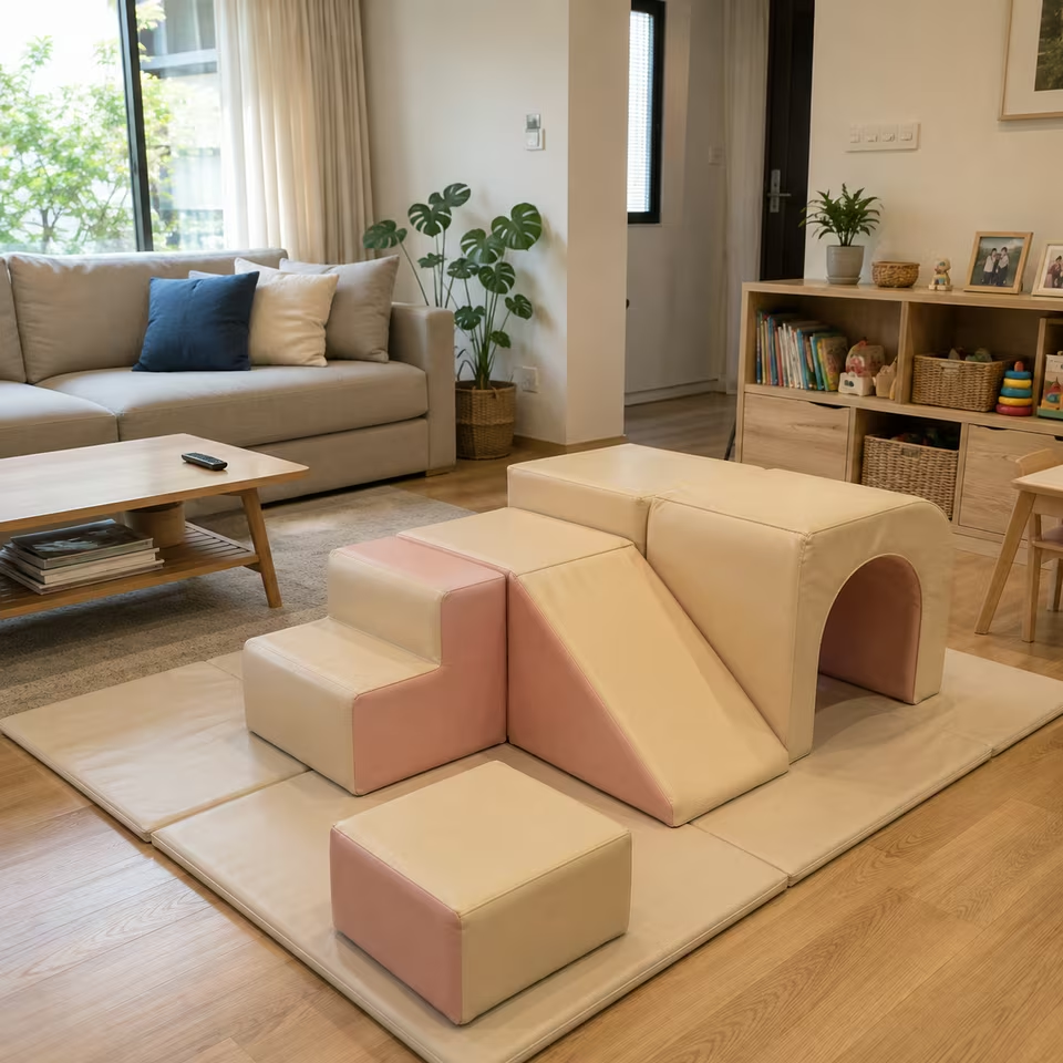
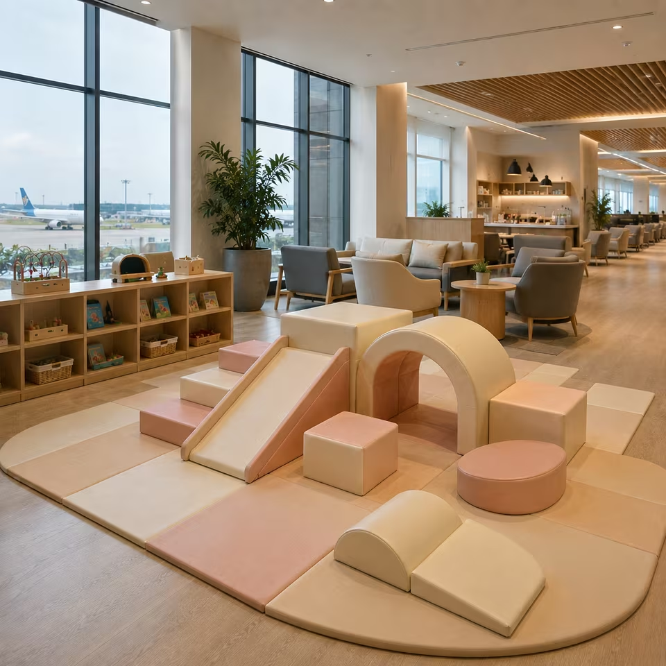
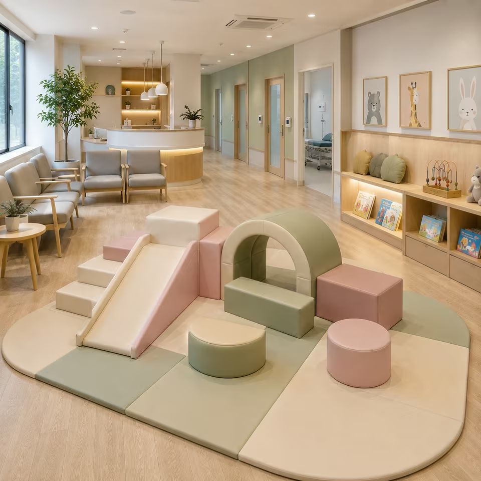
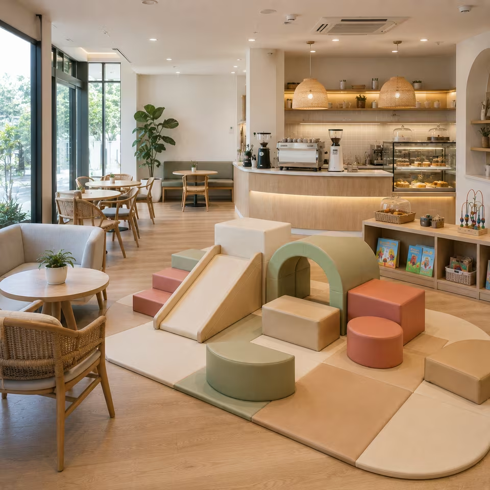



What is the CREAMY SKY BLUSH Soft Play theme?
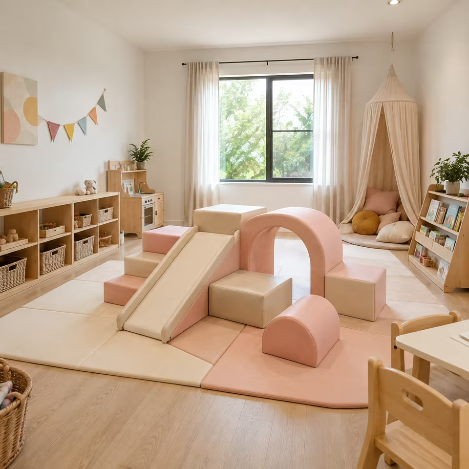
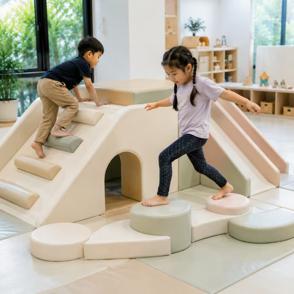
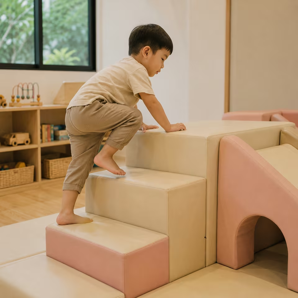
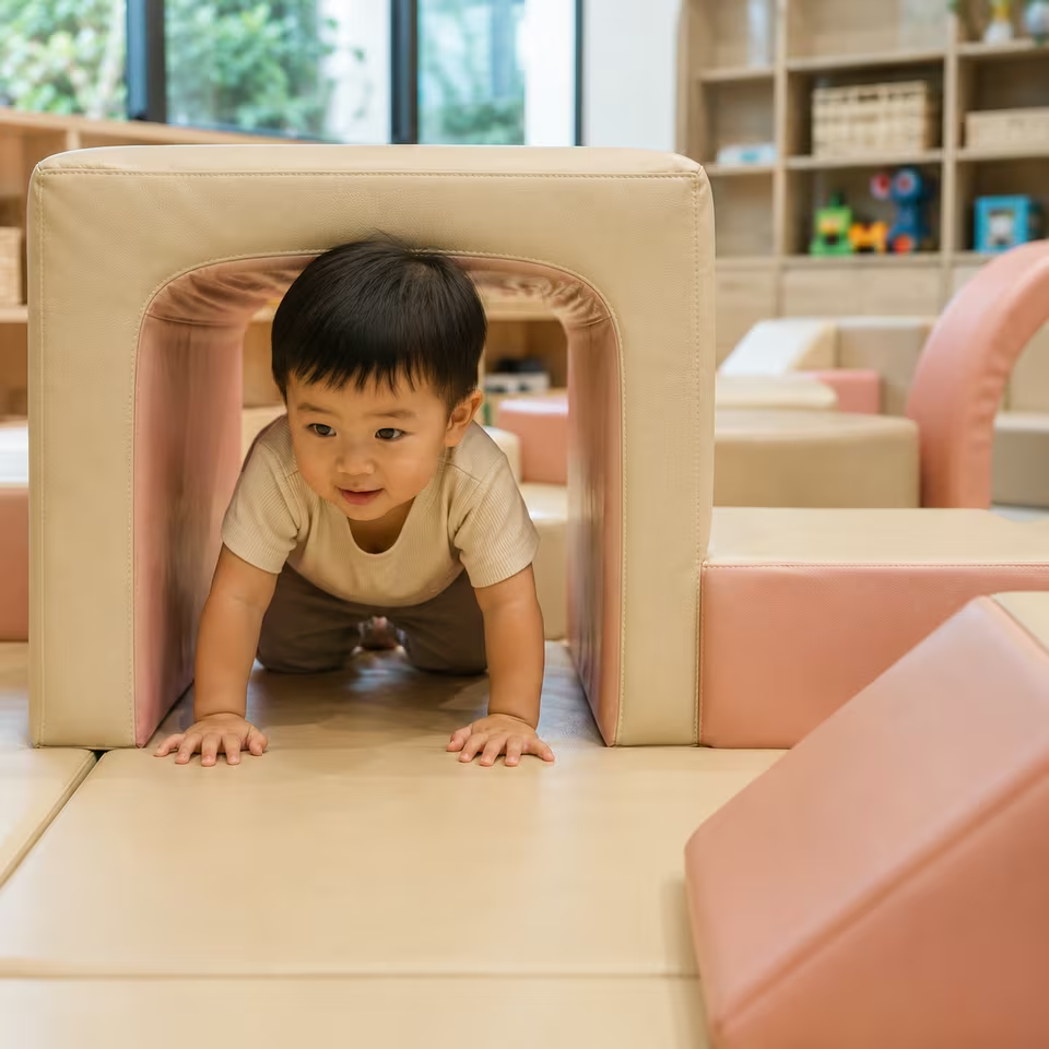
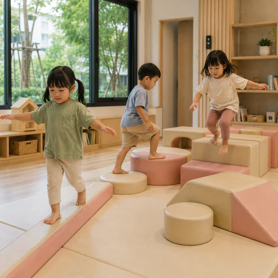
CREAMY SKY BLUSH is a soft pastel palette combining creamy neutrals with sky blue and blush pink. The three colors are balanced to create a cheerful, gentle and modern Soft Play aesthetic.
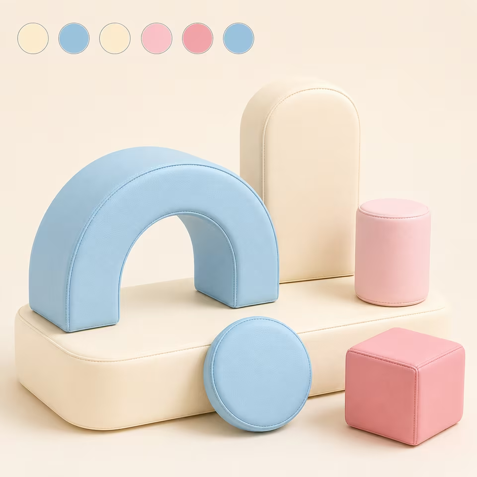
A soft pastel Soft Play palette combining creamy neutrals, airy sky blue and gentle blush pink for a bright, cheerful and beautifully balanced play environment.
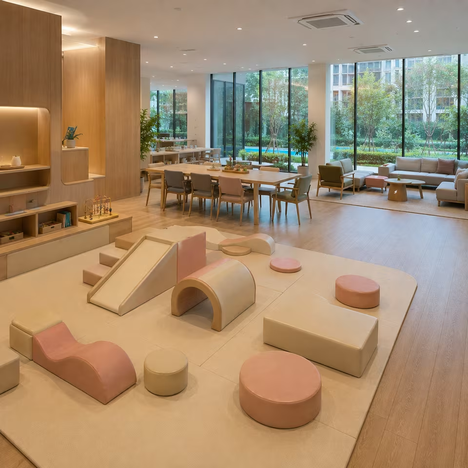
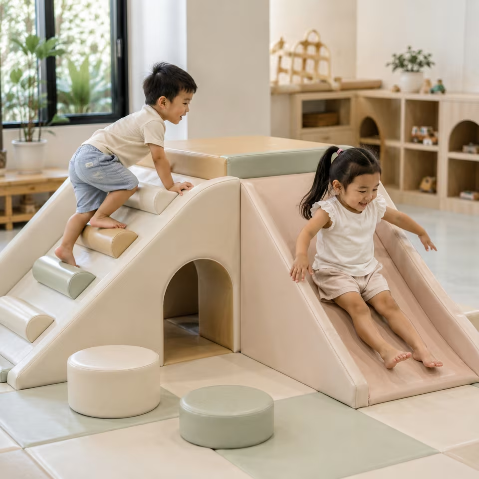
CREAMY SKY BLUSH brings together the airy freshness of soft sky blue and the warmth of blush pink over a creamy neutral foundation. The palette is colorful enough to feel distinctly playful while remaining gentle, cohesive and easy to integrate with contemporary interiors. Cream provides visual breathing room, sky blue introduces a light and refreshing character, and blush adds warmth without making the theme overly pink. Carefully balancing these three color families creates a Soft Play environment that feels cheerful and child-friendly without relying on highly saturated colors. The palette works naturally with light wood, warm white, beige and other soft neutral finishes, making it well suited to modern playrooms and thoughtfully designed kids' spaces.
CREAMY SKY BLUSH is a soft pastel palette combining creamy neutrals with sky blue and blush pink. The three colors are balanced to create a cheerful, gentle and modern Soft Play aesthetic.
The palette centers on creamy neutrals, soft sky blue and gentle blush pink. Lighter supporting neutrals may be used to create separation and balance between the blue and pink elements.
No. Blush is balanced with clearly visible sky blue and a creamy neutral foundation. The intended character comes from the relationship between all three colors rather than allowing pink to dominate.
The palette can work well in spaces that do not want to rely on a single traditionally gender-associated color. Balancing sky blue and blush over a neutral cream foundation creates a broader pastel character rather than a predominantly blue or pink room.
It works naturally with soft modern, contemporary, Scandinavian-inspired and light neutral interiors, particularly those using cream, warm white and pale natural wood.
Warm white, cream, light beige, oatmeal and pale natural wood are useful surrounding tones because they support both sky blue and blush without competing with them.
CREAMY SKY BLUSH focuses primarily on cream, sky blue and blush pink, creating a more controlled three-color identity. Rainbow themes introduce a broader family of accent colors and therefore feel more multicolored.
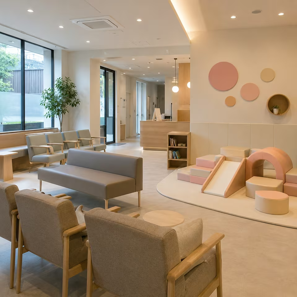
Yes. The creamy foundation and restrained pastel colors allow the Soft Play to feel cheerful and child-friendly while remaining compatible with contemporary interior design.
The visual theme can work well in customer-facing spaces seeking a soft, bright and friendly aesthetic. Suitability of individual Soft Play products for commercial use should still be evaluated from their specifications and intended use.